Blog
What Makes a Logo Stitchable? A Practical Guide


A logo can look perfect on a website, business card, or social post and still need a few adjustments before it belongs on a polo, cap, or jacket. What makes a logo stitchable is not just whether it is attractive. It is whether the artwork can be translated into thread with clean detail, readable lettering, and a professional finish at the size you need.
That distinction matters when you are ordering uniforms for your crew, team apparel for a season, or branded pieces for an event. Embroidery adds texture and presence, but thread follows different rules than ink on paper or pixels on a screen. A little planning at the beginning helps your finished items represent your organization well.
What Makes a Logo Stitchable for Embroidery?
A stitchable logo has clear shapes, enough space between details, lettering that remains readable, and colors that can be separated into thread areas. The design also needs to work at its intended embroidered size. A logo that looks crisp at 10 inches wide may become crowded when placed at 3.5 inches on the left chest of a polo.
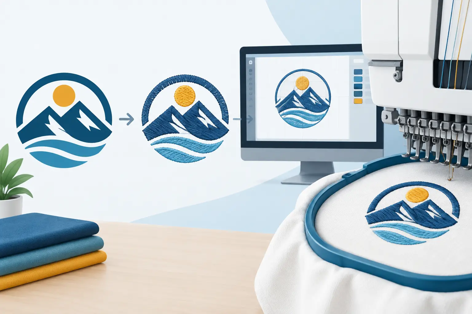
Before embroidery begins, artwork is prepared through a process called digitizing. This is not simply converting a file from one format to another. Digitizing maps out how the embroidery machine will build the design in thread, including stitch direction, layering, and the sequence of colors. Good source artwork gives that process a stronger starting point, but an experienced production partner can often recommend practical refinements when a design needs help.
The goal is not to change the identity of your logo. It is to preserve the parts people recognize most while making sure they read clearly on the finished garment or accessory.
Clean Shapes Create Cleaner Stitches
Simple, well-defined shapes generally embroider more clearly than highly detailed artwork. Solid icons, bold line work, and distinct outlines give thread room to do its job. Fine texture, tiny decorative elements, soft gradients, and hairline strokes can be harder to reproduce because embroidery is made from individual stitches, not continuous ink.
Think about a small tree icon. A version with a solid trunk and a few defined branches may stitch beautifully. A version with dozens of thin twigs, leaf veins, and subtle shading may lose clarity at a standard apparel size. That does not mean detailed logos are unusable. It means the design may need a simplified embroidery version that keeps the same overall look.
This is especially useful for organizations with a detailed full-color logo. You may use the complete artwork for printed banners, flyers, or DTF apparel while using a cleaner version for embroidered hats and uniforms. Keeping both versions on hand gives your brand more flexibility without asking one decoration method to do everything.
Small Gaps and Thin Lines Need Room
Negative space is the open area between letters, shapes, and lines. In embroidery, very narrow gaps can close up or become less noticeable once thread is stitched into fabric. Likewise, very thin lines may not show consistently at a small scale.
A helpful rule of thumb is to prioritize separation. If two elements are intended to look distinct, there needs to be enough visible room between them. A slightly wider gap or a somewhat bolder outline can make a major difference in the finished design.
Lettering Is Often the Deciding Factor
Text is one of the most common reasons a logo needs adjustment for embroidery. Company names, school names, departments, taglines, and contact information can all look great in a digital file but become difficult to read when scaled down.
Letters need enough height and stroke thickness for thread to form them clearly. Clean, straightforward typefaces tend to perform better than very narrow scripts, delicate serifs, or letters with lots of ornamental detail. Uppercase lettering can sometimes improve readability, although it depends on the font and the words themselves.
The smallest text deserves the closest look. A short company name may work well on a left chest, while a long slogan beneath it may be better left off that location. It could be placed on a larger back design, moved to a sleeve if appropriate, or reserved for a printed piece where tiny details can be reproduced differently.
This is a trade-off worth making. A logo does not have to include every word from your website to do its job on a garment. The strongest embroidered logo is often the one people can identify quickly from a few feet away.
Size and Placement Change the Design
There is no single perfect embroidery size. A design for the front of a cap has different space limits than a left-chest polo logo, jacket back, or tote bag. The garment itself also affects the decision. A logo that looks balanced on a roomy jacket may feel oversized on a smaller polo or youth shirt.
When planning an order, start with where the logo will go and how people will view it. A chest logo should be clear at a compact size. A large back design has more room for an emblem, additional text, or more complex elements. Hats typically call for a simplified approach because their embroidery area is smaller and curved.
It also helps to consider your audience. A contractor’s work shirt may need a bold, easily recognized logo. A staff polo for a front office may call for a more refined, understated presentation. Both can be stitchable, but their best sizing and placement may be different.
Color Choices Should Stay Clear
Embroidery uses thread colors, so artwork needs distinct color areas rather than subtle blends. Strong contrast between the logo and the garment is just as important as the colors within the logo itself. A dark logo can disappear on a dark garment, while a pale thread color may need a darker background to stand out.
Gradients, photo-like shading, and extremely subtle color shifts are usually better suited to printing methods. For embroidery, clear color blocks typically create the most recognizable result. That is why many successful embroidered logos use a limited palette and let the texture of the thread add visual interest.
If your logo has several colors, that is not automatically a problem. The question is whether each color has a clear purpose and enough space to appear as its own stitched area. Small color slivers may need to be combined, enlarged, or removed for the embroidered version.
Fabric and Item Type Matter Too
The same logo can look different on a structured cap, a smooth polo, a fleece jacket, or a workwear layer. Fabric texture, thickness, stretch, and seams all influence how embroidery sits on the item. A design that works comfortably on one product may need a different size or placement on another.
This is why it helps to decide on your products early in the ordering process. If your organization needs polos, hats, and jackets, the logo may require slight variations to look its best across all three. Those variations can still feel consistent. The icon, name, colors, and overall identity remain recognizable while the details are adapted to each item.
For coordinated orders, it is smart to identify the logo elements that cannot change and the details that can. Your main mark and company name may be essential. A small tagline, secondary border, or extra line of text may be optional when space is tight.
Start With the Best Artwork You Have
Clear original artwork makes logo review easier. Vector files are often helpful because they can be resized without becoming blurry, but high-quality PDF, PNG, or other clean logo files can also provide a useful starting point. Screenshots, photographs of signs, and low-resolution web images may still communicate your idea, though they can require more cleanup before production.
When you submit your logo, include any details that help tell the full story: the item you want embroidered, preferred placement, approximate order quantity, and whether the logo must match existing uniforms or branded materials. If you are unsure which version of your logo is best, sending the files you have is a practical first step.
A production conversation can catch issues before the embroidery stage. For example, you may learn that a small line of text should be removed for hats, that a border needs more space, or that a larger placement better fits your full logo. Those are not setbacks. They are the adjustments that help turn a digital mark into apparel your people will be proud to wear.
A Quick Stitchability Check Before You Order
Before sharing your artwork, take a close look at four areas: the smallest lettering, the thinnest lines, the tightest spaces, and the smallest separate color areas. If any of them are hard to see when your logo is reduced to the size of a left-chest design, they may need attention for embroidery.
You do not need to know embroidery terminology to begin. Bring the logo, the purpose behind the order, and the products you have in mind. Busy Bee Stitches can help you think through the practical details so your business, school, team, or event gear feels polished and personal.
A stitchable logo is ultimately one that stays recognizable when thread takes the place of ink. Give the design enough room to speak clearly, and it can become a lasting part of the uniforms, gifts, and apparel that bring your people together.
Latest Post