Blog
Embroidery Digitizing Guide for Cleaner Logos

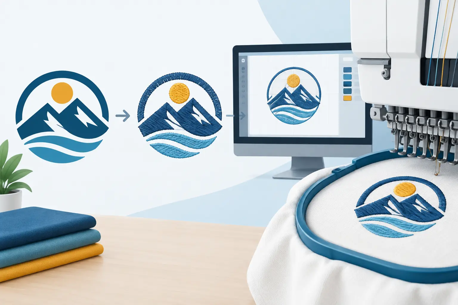
A company logo can look perfect on a screen and still need thoughtful preparation before it becomes embroidery. This embroidery digitizing guide explains the behind-the-scenes step that turns your artwork into stitched apparel that looks intentional, readable, and right for your team, event, or organization.
Embroidery is not simply a printed image made with thread. Every stitch has direction, density, length, and a job to do. That is why a clean logo file is a helpful starting point, but it is not the same thing as an embroidery-ready design.
What Embroidery Digitizing Actually Means
Embroidery digitizing is the process of creating a stitch file from a logo, name, or artwork. The file tells an embroidery machine where to place stitches, which colors to use, when to trim thread, and how each part of the design should be built.
A skilled digitized design accounts for more than the shape of the logo. It considers the fabric, the placement, the size of the design, and the kind of details that thread can realistically reproduce. A polo logo, for example, may need a different approach than the same logo embroidered on the front of a cap or the back of a jacket.
The goal is not to copy every pixel from the original artwork. The goal is to create a stitched version that remains clear, balanced, and recognizable on the finished product.
Why the Artwork File Still Matters
The better the starting artwork, the easier it is to make sound digitizing decisions. Vector artwork is often especially useful because it contains clean lines and scalable shapes. Common examples include AI, EPS, SVG, and high-quality PDF files. A crisp PNG can also be helpful, particularly when it has a transparent background.
That said, customers do not need to be design professionals to begin a custom embroidery project. A JPG from a website, a photo of a previous shirt, or even a clear image of a logo may provide enough information to start a conversation. The key is being upfront about what you have and what you want the finished item to look like.
If an image is blurry, tiny, or heavily detailed, it may require artwork cleanup or a simplified embroidery version. That is not a sign that your logo is poor. It simply reflects the difference between ink on a screen and thread on fabric.
Details That May Need Simplifying
Very thin lines, tiny lettering, color gradients, and closely packed shapes can be challenging in embroidery. Thread has physical width, so it cannot create the same fine detail as a printed graphic. When a design is reduced to a small left-chest size, details that looked clear in a large digital file can crowd together.
A good approach is to protect the parts people need to recognize first: the business name, main icon, school initials, team mark, or event message. Secondary details may need to be enlarged, adjusted, or removed so the overall design reads well from a normal viewing distance.
Choosing the Right Size and Placement
Size is one of the biggest factors in successful embroidery. A design that works beautifully across the back of a jacket may not work at the small scale used on a polo or cap. Before digitizing begins, it helps to know where the design will be placed and the approximate size you have in mind.
For business uniforms, a left-chest logo is often selected because it looks professional and keeps the brand visible without overwhelming the garment. Hats typically call for a bolder, simpler version of the logo because the embroidery area is compact and the fabric has structure. Names, monograms, and short messages can be a great fit for sleeves, cuffs, bags, and personalized gifts.
Placement also affects visibility. A circular emblem may suit a cap front nicely, while a wide horizontal logo could need a different position or a stacked version to avoid looking too small. It depends on the garment and your priorities. If your organization wants a refined uniform look, a clean, modest chest logo may be best. If you are creating spirit wear for a big event, a larger design may be the better choice.
Fabric Changes the Way a Design Stitches
Not all garments behave the same under embroidery. Smooth, stable fabrics such as many polos, jackets, and work shirts offer a reliable base for logos. Stretchy, textured, lightweight, or fleece-like materials may need different support and stitch settings to help the design keep its shape.
This is one reason it is helpful to decide on garments before finalizing the embroidery file. A design prepared for one fabric may not always be the best choice for another. Structured caps, for instance, can need different stitch planning than soft knit beanies or performance apparel.
The same applies to thread color. Thread samples may look different against a dark navy jacket than against a light gray polo. Contrast matters. A logo with several similar shades can lose definition if the colors blend into the garment or into one another.
What to Share When Requesting Embroidery
A clear custom-order request saves time and helps your production partner guide the project in the right direction. Along with your logo or design inspiration, share the garment type, the item colors, the quantity, and where you would like the embroidery placed.
It is also useful to mention who will wear or receive the items. Employee uniforms, school staff apparel, team gear, reunion jackets, and embroidered gifts can each have different needs. A small business may want a polished logo that stays consistent across polos and outerwear. A family ordering keepsakes may care most about names, dates, and a meaningful personal touch.
If you have used the logo before, a photo of the previous embroidery can be valuable. It gives a production team a reference for size, colors, and the version of the mark your group recognizes. If you did not love the earlier result, that information helps too. Say what felt too small, too busy, or hard to read.
Common Questions in an Embroidery Digitizing Guide
Can every logo be embroidered?
Many logos can be adapted for embroidery, but not every element can be reproduced exactly at every size. Detailed illustrations and very small text may need a simplified version. The best solution is usually one that keeps your brand recognizable while giving thread enough room to do its job well.
Does a digitized logo work on every product?
Sometimes, but not always. A logo digitized for a standard left-chest placement may need adjustments for hats, small accessories, or larger jacket placements. Using the right version for each item helps the finished products look more polished.
Why does embroidered text need to be larger than printed text?
Printed ink can create tiny, crisp letterforms. Embroidery uses stitches, and those stitches need enough space to form readable letters. Increasing the text size or choosing a clearer font style can make a meaningful difference.
Should I send brand colors?
Yes. If your organization has preferred colors, share them along with your logo. Thread colors are selected to create a close visual match, while also considering contrast against the garment. For a consistent look across a larger order, color guidance is especially helpful.
A Better Result Starts With a Conversation
Good digitizing is part design judgment and part production planning. It brings together your logo, the garment, the placement, and the purpose of the finished piece. That is why the simplest-looking embroidery often has the most careful decisions behind it.
At Busy Bee Stitches, the focus is on helping customers bring their ideas to life without making them learn every technical term first. Bring the logo, the garment idea, or even a rough starting point. With the right preparation, your embroidered apparel can feel personal, professional, and ready to represent the people behind it.
Latest Post